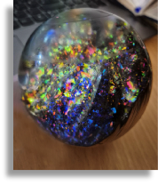
Colour can change how a rounded wooden form is perceived. A contrasting area may emphasise the top, define a band or draw attention to one side. Before thinking about a particular colouring method, it helps to decide the visual purpose of the colour.
A restrained palette makes relationships easier to assess. Compare a single accent with a larger coloured area in a paper drawing. The smaller accent may create a focal point; the larger area may change the character of the whole object. Leave some versions plain so there is a useful reference for comparison.
Grain and applied colour can either work together or compete. A busy natural pattern may need a different approach from a visually quiet surface. The archive photograph cannot establish the exact materials used, but it can support a discussion of contrast, placement and the amount of visible timber.
Create several small colour studies using the same outline and choose the version that best expresses the intended mood. Record why you prefer it. A written design intention helps keep later decisions consistent, and makes it easier to explain the piece during a show-and-tell discussion.